



+44 20 7946 2814
studio@luxelensvisuals.com
Contact
EMOTION
MOTION
Light
VISUALS SHAPED BY
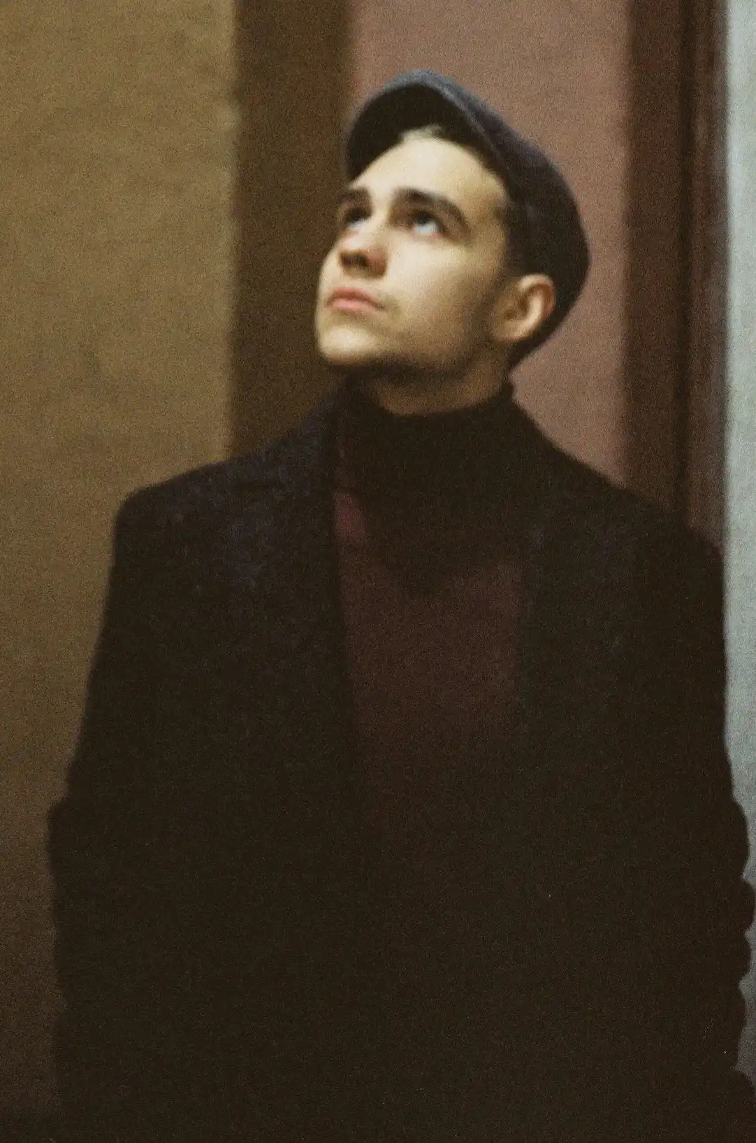
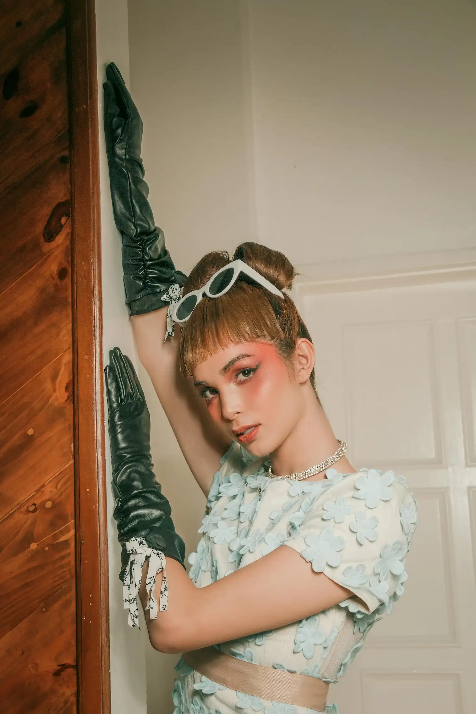
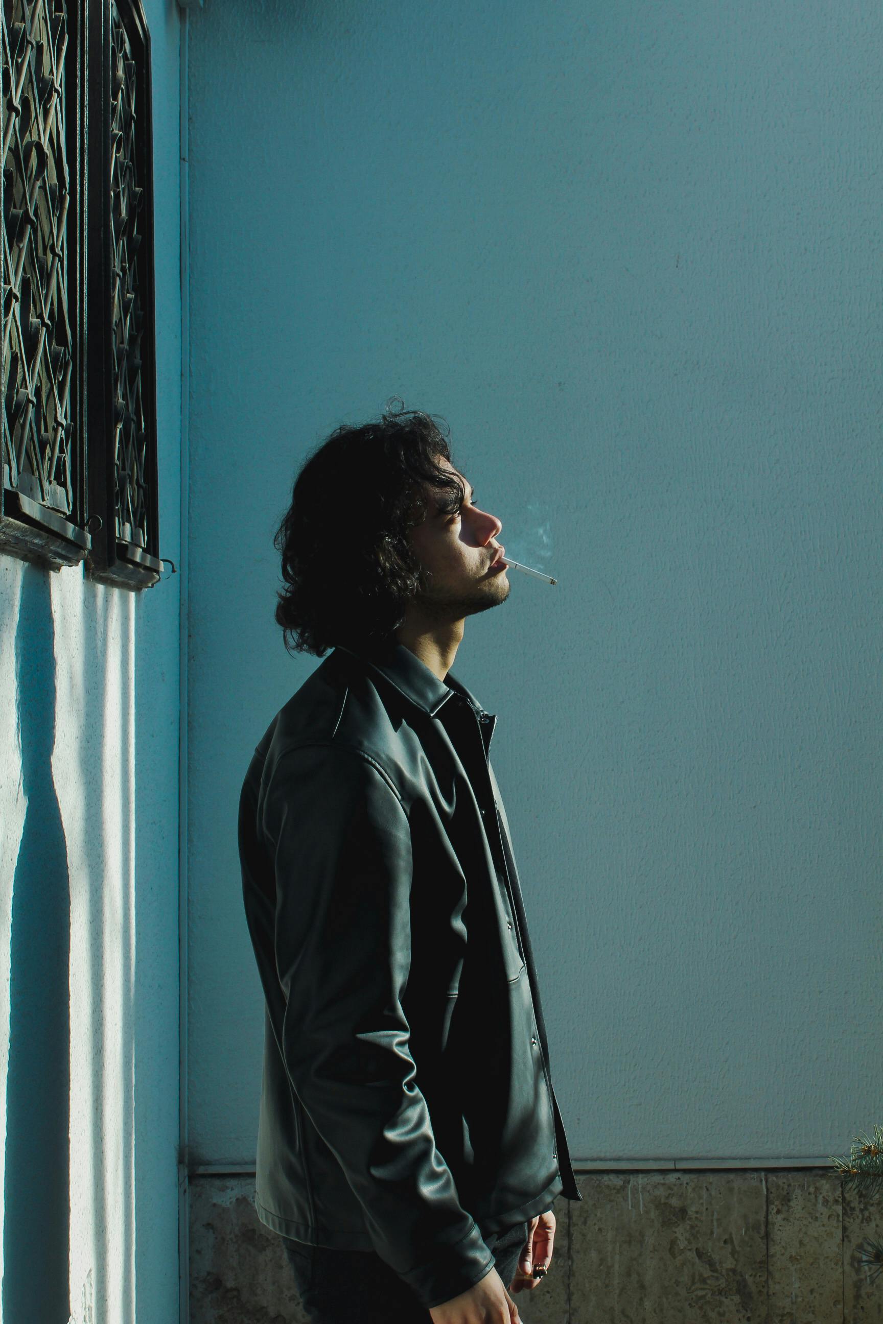
Creating immersive cinematic experiences through photography, editorial composition, and modern visual storytelling designed to leave a lasting impression across every frame.
+44 20 7946 2814
studio@luxelensvisuals.com
Contact
EMOTION
MOTION
Light
VISUALS SHAPED BY
Creating immersive cinematic experiences through photography, editorial composition, and modern visual storytelling designed to leave a lasting impression across every frame.

+44 20 7946 2814
studio@luxelensvisuals.com
Contact
EMOTION
MOTION
Light
VISUALS SHAPED BY
Creating immersive cinematic experiences through photography, editorial composition, and modern visual storytelling designed to leave a lasting impression across every frame.
Color, Mood & Visual Emotion
Photography Techniques
Emily Carter
6 min read
Color Theory, Editing, Lightroom
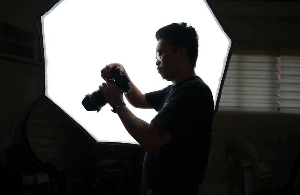
Explore how color palettes, contrast, and tonal balance influence emotion, helping photographers create stronger visual narratives that leave lasting impressions.
Using Color to Shape Emotion
Color plays a powerful role in photography. Before viewers notice composition or technical details, they often respond to the mood created by color. Warm tones can feel inviting and nostalgic, while cooler shades create calmness, elegance, or mystery. Learning to use color intentionally allows photographers to guide emotion and strengthen every visual story.
Understanding Color Psychology
Different colors naturally influence how an image is perceived. Warm colors such as orange, red, and yellow often communicate energy, romance, and happiness, making them popular in lifestyle and wedding photography.
Cool tones like blue and green create peaceful, thoughtful, or cinematic atmospheres. Choosing the right palette helps support the message behind each photograph instead of relying solely on editing.
Working With Natural Light
Light and color always work together. Morning light produces soft, cool tones, while golden hour fills a scene with warmth and depth. Even cloudy weather can create beautifully balanced colors by diffusing harsh sunlight.
Rather than forcing a scene to match a particular style, photographers should observe how available light naturally shapes color before reaching for editing tools.
Creating a Consistent Style
A recognizable portfolio often comes from consistent color grading rather than dramatic editing. Whether you prefer muted earth tones, vibrant colors, or clean neutral palettes, maintaining a similar look across your work creates a stronger visual identity.
Clients are often drawn to photographers whose galleries feel cohesive and professionally curated.
Styling With Color
Clothing, backgrounds, and props all contribute to the final mood of a photograph. Neutral outfits create timeless portraits, while carefully chosen accent colors can add personality without distracting from the subject.
Planning these elements before the shoot helps create harmony throughout the final images.
Final Thoughts
Color is much more than an editing adjustment—it is an emotional storytelling tool. By understanding how light, wardrobe, and color palettes work together, photographers can create images that feel intentional, memorable, and visually engaging. The most powerful photographs don't simply look beautiful—they make viewers feel something through every carefully chosen color.
Other stories
Continue the journal

Recommended
Inside an Editorial Photoshoot
Discover how thoughtful planning, creative direction, and collaboration transform an ordinary concept into a compelling editorial photoshoot.
Recommended
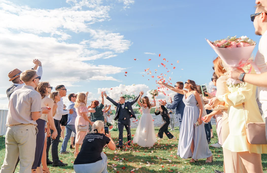
The Beauty of Candid Weddings
Learn how documentary-style photography allows genuine emotions and unforgettable moments to unfold naturally while preserving the authenticity of every wedding celebration.
Recommended
Color, Mood & Visual Emotion
Explore how color palettes, contrast, and tonal balance influence emotion, helping photographers create stronger visual narratives that leave lasting impressions.
Color, Mood & Visual Emotion
Photography Techniques
Emily Carter
6 min read
Color Theory, Editing, Lightroom
Explore how color palettes, contrast, and tonal balance influence emotion, helping photographers create stronger visual narratives that leave lasting impressions.
Using Color to Shape Emotion
Color plays a powerful role in photography. Before viewers notice composition or technical details, they often respond to the mood created by color. Warm tones can feel inviting and nostalgic, while cooler shades create calmness, elegance, or mystery. Learning to use color intentionally allows photographers to guide emotion and strengthen every visual story.
Understanding Color Psychology
Different colors naturally influence how an image is perceived. Warm colors such as orange, red, and yellow often communicate energy, romance, and happiness, making them popular in lifestyle and wedding photography.
Cool tones like blue and green create peaceful, thoughtful, or cinematic atmospheres. Choosing the right palette helps support the message behind each photograph instead of relying solely on editing.
Working With Natural Light
Light and color always work together. Morning light produces soft, cool tones, while golden hour fills a scene with warmth and depth. Even cloudy weather can create beautifully balanced colors by diffusing harsh sunlight.
Rather than forcing a scene to match a particular style, photographers should observe how available light naturally shapes color before reaching for editing tools.
Creating a Consistent Style
A recognizable portfolio often comes from consistent color grading rather than dramatic editing. Whether you prefer muted earth tones, vibrant colors, or clean neutral palettes, maintaining a similar look across your work creates a stronger visual identity.
Clients are often drawn to photographers whose galleries feel cohesive and professionally curated.
Styling With Color
Clothing, backgrounds, and props all contribute to the final mood of a photograph. Neutral outfits create timeless portraits, while carefully chosen accent colors can add personality without distracting from the subject.
Planning these elements before the shoot helps create harmony throughout the final images.
Final Thoughts
Color is much more than an editing adjustment—it is an emotional storytelling tool. By understanding how light, wardrobe, and color palettes work together, photographers can create images that feel intentional, memorable, and visually engaging. The most powerful photographs don't simply look beautiful—they make viewers feel something through every carefully chosen color.
Other stories
Continue the journal
Recommended
Inside an Editorial Photoshoot
Discover how thoughtful planning, creative direction, and collaboration transform an ordinary concept into a compelling editorial photoshoot.
Recommended
The Beauty of Candid Weddings
Learn how documentary-style photography allows genuine emotions and unforgettable moments to unfold naturally while preserving the authenticity of every wedding celebration.
Recommended
Color, Mood & Visual Emotion
Explore how color palettes, contrast, and tonal balance influence emotion, helping photographers create stronger visual narratives that leave lasting impressions.
Color, Mood & Visual Emotion
Photography Techniques
Emily Carter
6 min read
Color Theory, Editing, Lightroom
Explore how color palettes, contrast, and tonal balance influence emotion, helping photographers create stronger visual narratives that leave lasting impressions.
Using Color to Shape Emotion
Color plays a powerful role in photography. Before viewers notice composition or technical details, they often respond to the mood created by color. Warm tones can feel inviting and nostalgic, while cooler shades create calmness, elegance, or mystery. Learning to use color intentionally allows photographers to guide emotion and strengthen every visual story.
Understanding Color Psychology
Different colors naturally influence how an image is perceived. Warm colors such as orange, red, and yellow often communicate energy, romance, and happiness, making them popular in lifestyle and wedding photography.
Cool tones like blue and green create peaceful, thoughtful, or cinematic atmospheres. Choosing the right palette helps support the message behind each photograph instead of relying solely on editing.
Working With Natural Light
Light and color always work together. Morning light produces soft, cool tones, while golden hour fills a scene with warmth and depth. Even cloudy weather can create beautifully balanced colors by diffusing harsh sunlight.
Rather than forcing a scene to match a particular style, photographers should observe how available light naturally shapes color before reaching for editing tools.
Creating a Consistent Style
A recognizable portfolio often comes from consistent color grading rather than dramatic editing. Whether you prefer muted earth tones, vibrant colors, or clean neutral palettes, maintaining a similar look across your work creates a stronger visual identity.
Clients are often drawn to photographers whose galleries feel cohesive and professionally curated.
Styling With Color
Clothing, backgrounds, and props all contribute to the final mood of a photograph. Neutral outfits create timeless portraits, while carefully chosen accent colors can add personality without distracting from the subject.
Planning these elements before the shoot helps create harmony throughout the final images.
Final Thoughts
Color is much more than an editing adjustment—it is an emotional storytelling tool. By understanding how light, wardrobe, and color palettes work together, photographers can create images that feel intentional, memorable, and visually engaging. The most powerful photographs don't simply look beautiful—they make viewers feel something through every carefully chosen color.
Other stories
Continue the journal
Recommended
Inside an Editorial Photoshoot
Discover how thoughtful planning, creative direction, and collaboration transform an ordinary concept into a compelling editorial photoshoot.
Recommended
The Beauty of Candid Weddings
Learn how documentary-style photography allows genuine emotions and unforgettable moments to unfold naturally while preserving the authenticity of every wedding celebration.
Recommended
Color, Mood & Visual Emotion
Explore how color palettes, contrast, and tonal balance influence emotion, helping photographers create stronger visual narratives that leave lasting impressions.